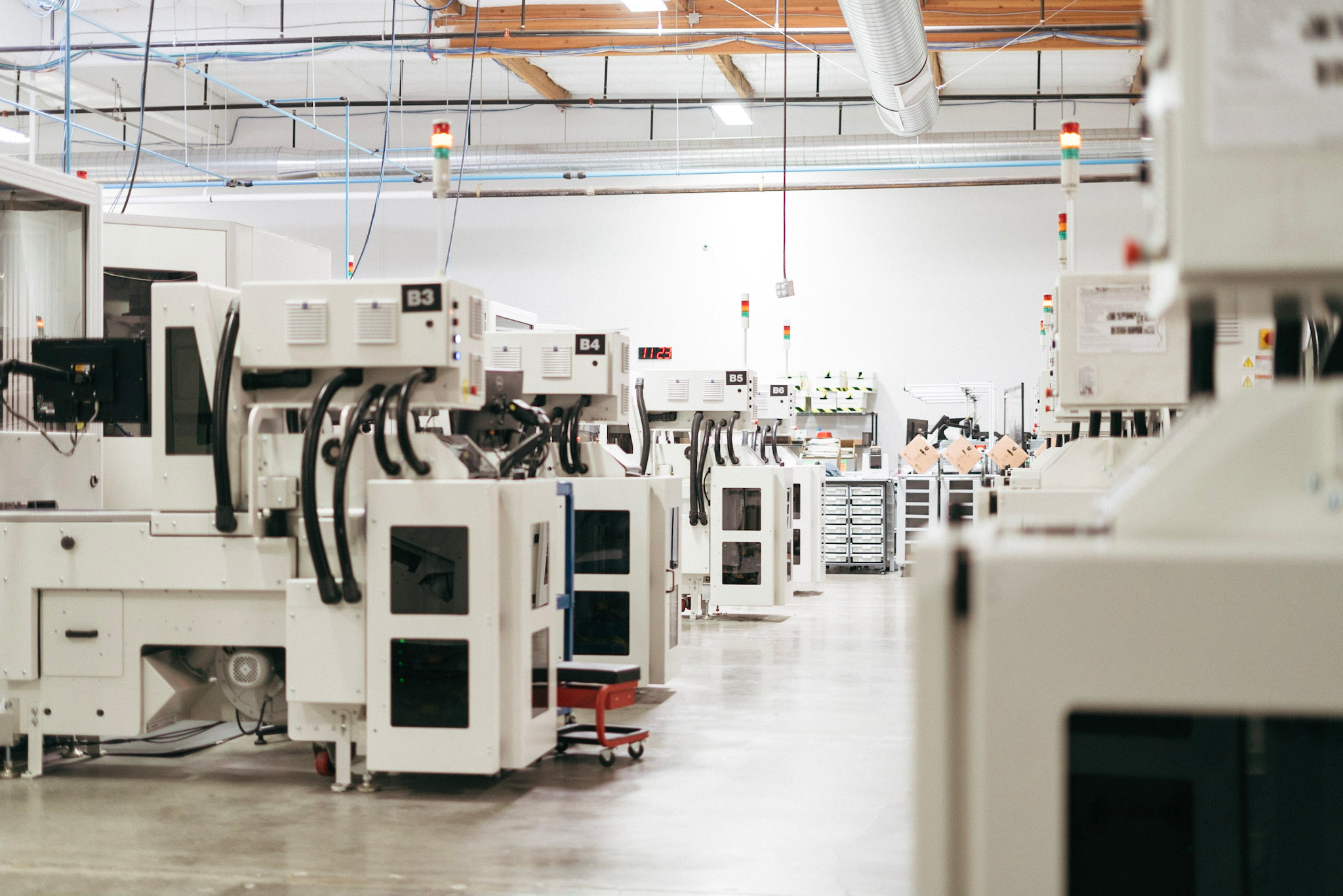


At their core, Ripcord is in the data business – taking mountains of documents and transforming them into data that can be easily stored and accessed. To explain how they do what they do, we broke their process down into three phases: Digitization, Intelligence and Access. We created robotic representations of the process to simplify and explain how each of the three interconnected steps is integral to the process.
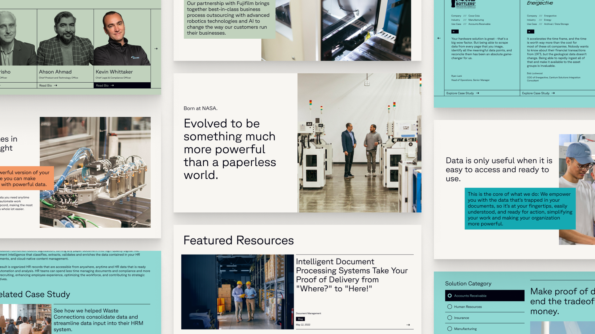
The look and feel of the overall site experience needed to feel modern and sophisticated yet approachable. Photography throughout the site helped to humanize the experience. Illustration was used to visualize a process that is mostly invisible. And the copy was written to be concise and put in terms that everyone from expert to noob could easily understand.